
Introducing Aptos, Microsoft's revolutionary default typeface

Aptos is a meticulously designed family of 24 fonts providing options for pairing contrasting designs to create visual impact confidently.
Since the grand reveal of Aptos, computers all over the globe are updating*. Now's the perfect chance for me to share layout examples and showcase the remarkable power of typography in shaping our daily choices.
Discover the Magic of Aptos: Unveiling the Transformation!
Aptos is on the brink of becoming the new go-to font for communication.
Aptos is created explicitly for reading on small and large screens.
With distinct letterforms and a wide range of styles, it is perfect for branding, documents, presentations, websites and more.
Supporting all major languages, Aptos unites global projects.
"Aptos: designed for small screens, print, and high-resolution digital formats. Setting the bar for precision in typography."
PowerPoint Documents and Presentations, Aptos is for Both.
PowerPoint provides collaboration services to share and improve ideas, reports, and plans. However, the result may occasionally need more refinement, overloading content with disjointed text.
"Don't underestimate the significance of a working document; within its slides lies valuable insights and untapped potential."
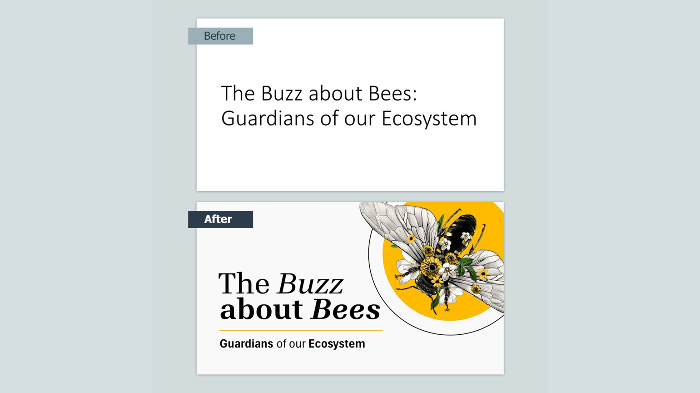
PowerPoint Document: magazine-style, follow-up document.
Use PowerPoint's 'Slide Sorter and Outline View' to organise your findings and remove unnecessary data, preparing it for design and sharing. Think of it as creating a magazine-style follow-up document for stakeholders and your audience to read your research, insights, and call to action; the Aptos typeface is designed especially for consuming digital information online, making it the perfect choice.
"The font's unique design ensures strong legibility, with carefully spaced letters that enhance readability and comprehension."
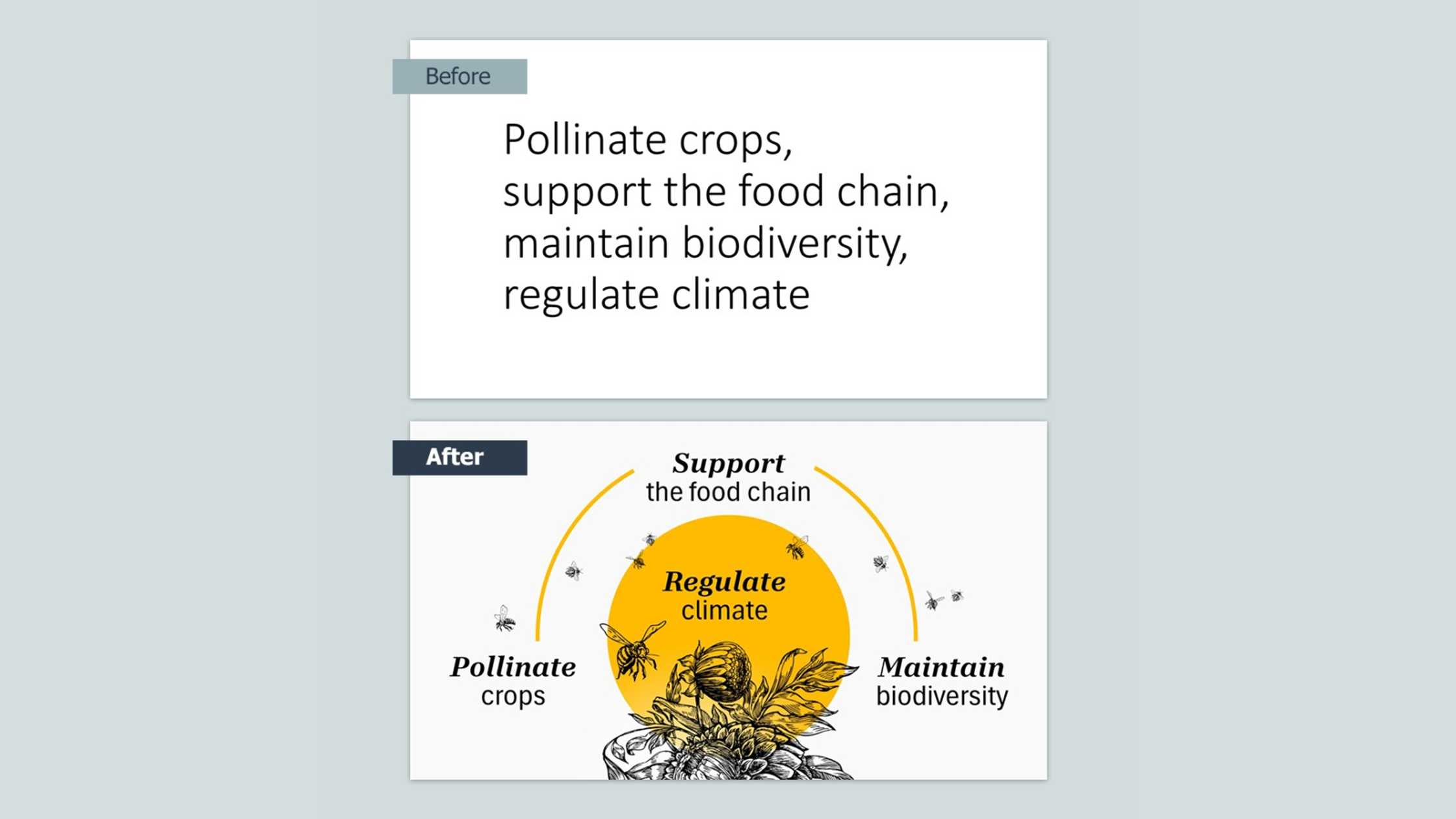
This PowerPoint Document: example uses contrasting Aptos fonts: intentional hierarchy and efficient use of space - pivotal for practical design. Aptos is ideal for those looking to evoke emotion and foster trust in their work with its adaptable nature for print and screen.

PowerPoint Presentation: Where the magic happens!
Whether in-person, online, or via video, presentations reduce your content further to pinpoint your insights, objectives, key message and call to action.
"Emotional triggers help your audience to remember, but like a billboard, they must absorb the feeling in a flash."
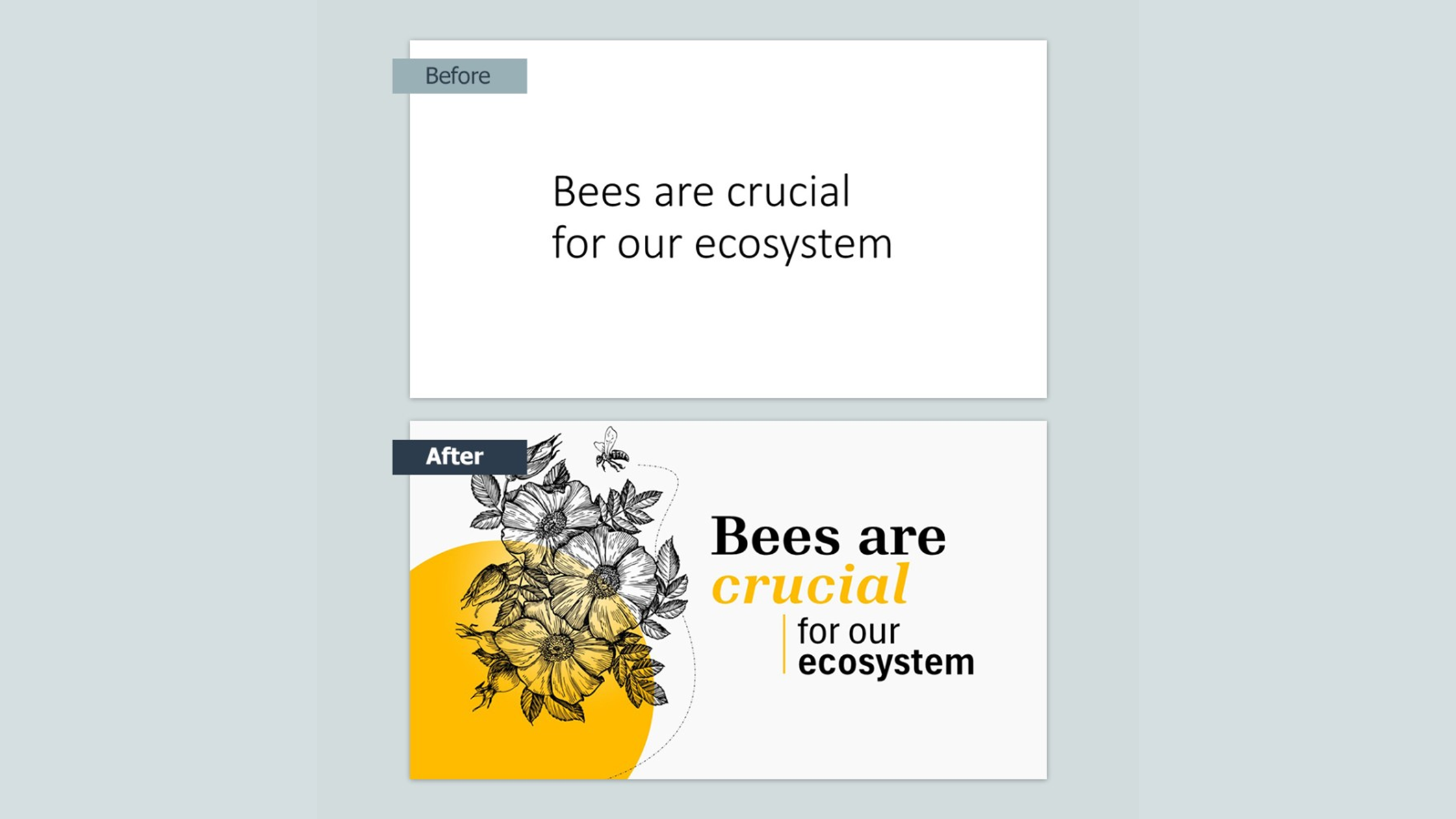
This PowerPoint Presentation example showcases the power of effective typography with memorable illustrative design by transforming structured documents into compelling visual displays. Slides support the speaker's voice, utilising illustrations, photos, and typography to help your audience remember and understand.
Meet Aptos: A Font With a Warm and Friendly Personality!
Steve Matteson, the mastermind behind Aptos, is one of the world's most notable type designers. Steve envisioned Aptos as a font with an understated, warm, and friendly personality, in contrast to the previous generic style of Calibri.
Creating Aptos was a challenging five-year task for Steve and his team. They focused on every font aspect, from letter spacing to size and descender line. Each stage required immense effort and attention to detail, tested under Bierstadt.

Conclusion: Why the Switch from Calibri to Aptos?
"With simplicity, legibility, and balance, Aptos is an impeccable choice for projecting trust, reliability, and warmth."
Microsoft's decision to replace Calibri with the default typeface Aptos represents a significant change that will impact the future of corporate markets. Aptos will subtly but significantly transform how Microsoft is perceived, aiming to shift the image of cold technology to one that is warm and trustworthy.
The typeface exudes a unique charm, striking a balance of approachability and readability. It shapes perception, conveys values, and captivates your audience.
Boost Your PowerPoint Presentation Skills: How To Help.
I want you to know that presentations are essential to communication in today's fast-paced business world and tight deadlines. Look around for inspiration; buses, posters and websites for examples and ideas to help.
Choosing the right font improves a presentation's effectiveness.
Aptos will become the choice for many corporate and private organisations.
Aptos is powerful for creating engaging and visually appealing presentations.
Clear font hierarchy leads the eye to the most important information first
Simple visuals using white space and increase memorable triggers.
Start and see the difference it can make to your next presentation!
2023: A refreshed Microsoft 365 default theme.
*The new default theme will start appearing across Word, Outlook, PowerPoint and Excel for hundreds of millions of users, then Mac and Android, with iOS to follow soon.
A fresh colour palette with contrasting Teal, Orange and Plum colours.
New font weights and sizes offer endless possibilities for captivating designs.
You will also see an update to the preset styles in Word. [Link Here]
Nice to know: The name Aptos was also Steve Matteson's idea, as it comes from a town in the Santa Cruz area of California (one of his favourite places) where the range in landscape and climate connected with his wish for human touch and the versatility of Aptos.
Emma Bannister [Microsoft MVP]
Founder & CEO, Presentation Studio, Microsoft MVP, Author
Microsoft MVP 2018-2004, Microsoft 365 Apps & Services
Sources:
